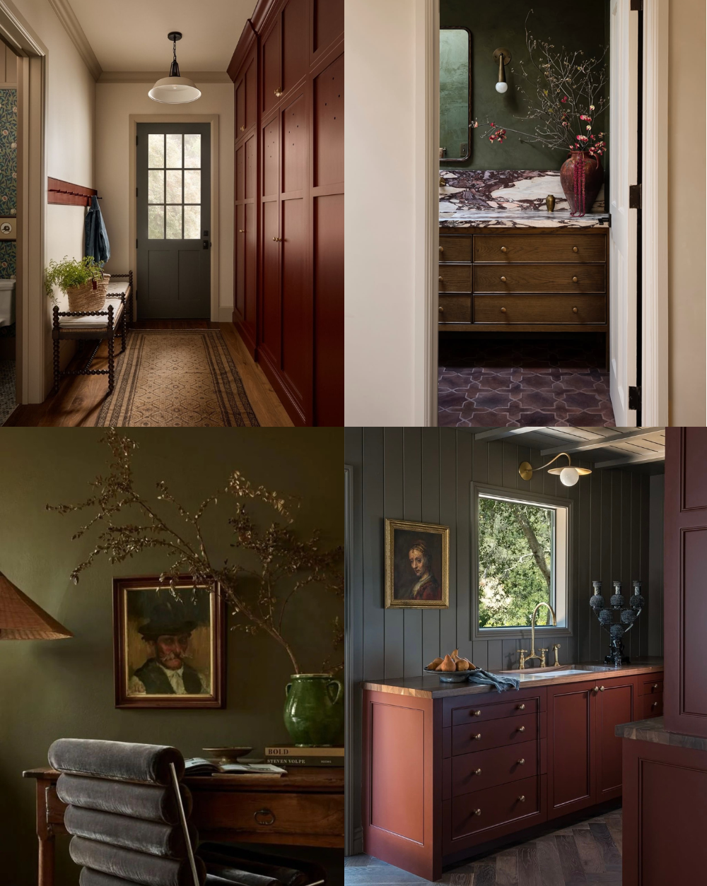
Bold Color Interiors: Palette Formulas for Depth and Drama
For years, interiors have leaned on the safe side. White walls, pale neutrals, and rooms designed to disappear rather than speak. That restraint had its place, but it also flattened homes that once felt expressive.
Bold color is returning not as decoration, but as structure. Used well, it gives a room weight, emotion, and permanence. It creates atmosphere instead of noise. The shift isn’t about novelty or trends. It’s about depth, visual tension, and personality
This guide breaks down how designers are using bold color now, with practical palette formulas that feel grounded rather than overwhelming.
Why Bold Color Disappeared (and Why It’s Back)
Throughout the last decade, design was shaped by resale anxiety, social media algorithms, and a wave of Instagram minimalism that rewarded sameness. White photographed well. Neutral homes felt flexible and adaptable to a range of furniture and decor styles.
As homes became more personal and less performative, that logic began to fall apart. Pinterest searches reflect the shift. Users aren’t looking for brightness. They’re searching for moody rooms, saturated spaces, and color-drenched interiors that feel grounded rather than trendy.
Bold color is returning not as decoration, but as structure.
For guidance on how to introduce color gradually, see our Design Guide Beyond Neutrals: How to Introduce Color with Intention.
Where Bold Color Works Best

Image via Pinterest
Bold color works best where it can fully shape the room, rather than compete with it.
Living rooms benefit from deep tones that ground large furniture and architectural elements
Dining rooms are ideal for drama, as they’re experienced in shorter, more atmospheric moments
Bedrooms respond well to saturated color that softens edges and quiets the space
Kitchens can carry bold color through cabinetry or islands, balanced by natural materials
Bathrooms are well suited for tonal saturation, where color becomes immersive rather than decorative
The Palette Formulas
These formulas are designed to be repeatable. They remove guesswork and help bold color feel resolved.
1. Bold + Quiet Neutral
One dominant color paired with a calm, grounding neutral.
Think deep green with plaster white, anchored by warm wood or aged brass.
The neutral is structural, and allows the bold color to breathe.
2. Tonal Saturation
One color, layered across multiple surfaces and depths.
Walls, trim, and upholstery stay within the same family, shifting only in saturation. Contrast comes from texture, not color variety.
This approach often feels calmer than high contrast rooms because nothing visually interrupts the field.
3. Bold Color + Aged Material
Saturated color becomes livable when paired with patina.
Worn wood, unlacquered brass, stone, or vintage textiles keep bold hues from feeling slick or new. The tension between polished color and imperfect materials is what gives the room credibility.
4. Controlled Contrast
Bold color used once, with restraint everywhere else.
A painted ceiling. A single built-in. Interior doors. Cabinetry.
The success of this formula depends on editing. One moment carries the room. Everything else supports it.
Styling Rules That Prevent Regret
Bold color succeeds when it’s treated like architecture, not an accessory.
Limit bold color to one or two dominant planes
Avoid pairing saturated paint with trendy finishes
Balance intensity with matte and textured surfaces
Repeat the color quietly through art, books, or objects
The goal is cohesion, not emphasis. This is where materials and finishes matter most. Lighting, textiles, and grounded furnishings often do more to support bold color than additional paint ever could.
See our Design Guide From Builder-Grade to Custom Home to explore other home upgrades rather than color alone.
Common Mistakes to Avoid
Using multiple bold colors without hierarchy
Ignoring undertones, especially in low light
Pairing saturated paint with builder-grade materials
Choosing color before understanding how the room is used
Most bold color regrets come from scale and context, not the color itself.
Closing Thought
Bold color isn’t about making a statement. It’s about giving a room a center of gravity.
When color is chosen for mood rather than attention, it creates rooms that feel grounded, expressive, and lived in. Depth follows naturally. Drama becomes quiet.
Used with restraint, bold color doesn’t overwhelm. It anchors.
Shop The Curated Edit
Pieces that ground bold color through texture, patina, and restraint.
Lighting
Purpose: Soften saturation and give bold color a warm counterweight.
Rugs
Purpose: Ground saturated color and introduce pattern without visual noise.
Textiles
Purpose: Add pattern and softness to bold rooms without competing with color.
Decorative Objects
Purpose: Introduce character and material contrast without visual clutter.


